Sunday, December 2, 2012

The Old Water Company

It's been too long since I posted anything on the building because I've been busy responding to  Hurricane Sandy's aftermath.  Fortunately the building was spared damages and we came out safe and sound in our Brooklyn apartment.    

We are so close to closing on the 203(k) loan.  It's just a matter of days to weeks (cross my fingers) as we wait for the contractor's information.

In the meantime, here's a little history on the building that I've been unearthing.

The building had been the W.T. Barnes Upholstery business for several decades.  The previous owner worked at the store since high school, and by the time we bought it, she was ready to retire.  

When we were at the Dobbs Ferry Festa about a couple months ago, we met a woman named Nancy Delmerico who told us that her father used to work at the building when it was the Water Company.  Nancy had a picture of her father, Patrick Delmerico, standing in front of the building (on the left) that was published in a local newspaper dated January 7, 1938.


Picture courtesy of Nancy Delmerico

Eager to find out more, I called the New Rochelle Water Company but did not get a call back.  Next I tried the Dobbs Ferry Historical Society, which had provided Rick with some information on the building several months ago.  In particular, Mary Donovan at the historical society, provided us with an excerpt from a book called Life of a River Village, Dobbs Ferry: a Centennial Publication.
"The left-hand side of Cedar Street, backed by the deep ravine, had a few small buildings...The building now occupied by Barnes Upholsterers belonged to W.G. Brown.  In 1911 it was to become the home of the Telephone Company, which outgrew its original office in the rear of Herbeck's Drug Store on Main Street."  

Page from Life of a River Village 

The historical society pointed me to the website:  http://fultonhistory.com/Fulton.html, which has information from early Dobbs Ferry newspapers.   

Searching for the address, I came across several references to the building that didn't seem to make sense; there were interesting advertisements that stated the building was a theater, a music & radio shop, and republican presidential challenger to FDR (Wendell Wilkie).  However, there's a theater across the street, so at least some of the listings didn't make sense there.

I asked the historical society about this.  Mary Donovan mentioned the street must have been renumbered.  She mentioned that there is a vague reference to renumbering in her records, but no detailed information is available.

As we continue this we may be able to put together a better timeline and have a more thorough history of the life of the building.

Thanks to both Nancy Delmerico and Mary Donovan for historical information!
Monday, October 1, 2012

Final Board Approvals


We made good progress in the last month.  Although we haven't started renovating yet, this incremental progress brings us much closer to renovations, as follows: 

Village Board Approvals
We got approval from both the Board of Trustees and the Architectural and Historical Review Board in September.  This completes the last of the four required board presentations.  The Board of Trustees were very encouraging, but before issuing their approval made sure that we would agree "to enter into discussions" with the Village on their plan to build a road and parking lot that would run along the backs of the buildings on our side of the street.  Preliminarily this would require an easement from us and our neighbors. We're not sure what type of footprint this would involve, but we'll cross that bridge when we get to it.  Unfortunately the Village is charging a very large recreation fee on top of the other permitting fees. These are adding up to be substantially more than we had initially planned.  Fortunately, we can incorporate these fees into our loan before we close because they sure are getting large.  

The Mayor later highlighted our project in his newsletter:
"In the downtown area, the Board of Trustees granted site plan approval for 32 Cedar Street, the property formerly known as WT Barnes. This will be for a new design and re-use of the building, including an office business and one residential unit (in the rear, facing Wickers Creek). The new Zoning Code and Vision Plan adopted by the board encourages re-use of downtown buildings, in particular new residential opportunities; this will increase 'foot traffic', creating a more viable downtown area for local business to succeed. In this case, the owners of the business and building will also be living in the building too! This is a good thing, and we welcome the new owners (and residents) to the village."
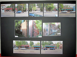
Although not originally planning to present to the Architectural and Historical Review Board in September, we were able to prepare the submittals in time for the deadline.  In the long run, this saved us about a month's worth of time. Design wise our goal is to maintain as much as possible the original look of the building that John C. MacKenzie, Jr. designed.  I learned to use a 3-D program called Sketchup to render the building in 3-d based on Rick's 2-d plans.  This allowed us to experiment with different colors on the façade.  

Existing streetscape, with existing building top center 

Color board with proposed finishes

Request for Bids
The bid package for the project went out to six contractors.  Two of those contractors dropped out because they're busy with other projects or didn't want to get involved with the 203(k) process.  That leaves us with four.  Once the bids are in, we'll check references and start negotiating with the lowest successful bidders.  We met with most of the contractors and got some good ideas for controlling costs.  We're including some of those ideas along with revisions in an addendum package, which will be submitted to the contractors for inclusion in the final bid.

Ferry Festa
Last weekend was the Dobbs Ferry Festa and we decided to participate as vendors.  We reserved a spot to advertise Rick's home inspection services and to meet the locals.  Rick spoke to several people who were interested in different aspects of the inspection process.  

Manning the Booth

Several people were curious about our building plans.  Fortunately we had the color board with us.  One person told us that her father used to work in the building when it was the local offices of the New Rochelle Water Company and that she might have a picture that she could share with us.  I was so excited I actually called the New Rochelle Water Company this morning to get more information.  

We made many connections at the Festa and exchanged great ideas.  I think we'll do this again next year, when we're living in the building and I may even participate by knitting up some pieces to sell.  I connected with two local homegrown businesses that are run by creative, young women.  One makes vegan soaps and the other sells tasty spices and chocolate.  Their products and their passion are energizing.

Wednesday, August 22, 2012

Fine-Tuning Design

The past several weeks we've been fine-tuning the building design for the Planning Board and our HUD consultant.  It's not really "we" because Rick’s doing all the work.  I’m just providing the moral support for all his grueling hours and my thoughts on the design as it forms.

Rick updated the site plan to include more detail on the retaining walls that will terrace the steep slopes on one side of the building.  The site plan also includes the trees we're removing and the ones we’re planting.  
One specific tree absolutely must go because it’s growing right up the side of the structure at the bottom of the basement!


We plan to put a small deck on one side of the building for access to the electric meters.  We were debating on making this a larger deck or another terraced area with a retaining wall, but it doesn't seem worth it at this point.  We may re-visit the idea of a deck, along with other wish list items a few years down the road. 
About a month ago we got the awesome news of our preliminary loan approval through the 203(k) process.  Since then we've met with our HUD consultant to prepare the work write-up that will kick-start contractor bidding.
The next few weeks we'll continue fine-tuning the design as we move forward on our submissions to the architectural review board.  More to follow!

Sunday, August 5, 2012

Slopes: 1-story in front, 3-stories in back

Our friend Andrew in Vancouver, BC started reading our blog and reported back that he wants to see the sides and back of the building to get a better idea of the whole shell.  This reminded me that we haven't yet posted anything on the limitation/benefit that our side slopes pose.  

When you look at our building from the street, it look like a one-story structure with a bunch of trees around it.  In fact, on the tax roll, the building is considered a one-story structure.


However, from the back the building is actually three stories tall.  All the buildings on this side of the street are built on a slope, so there's more building below the street level.


The steep slopes on both sides of the building are both a blessing and a curse.  The bad part is the erosion from the steep slopes is eating away portions of the hill.  


The previous owner built a ramp on one side of the building to easily roll in deliveries from the street to the level below, without the need to go through the inside stairs.


The benefit of the steep slopes is that they shelter our home from the busy downtown street on the front and affords us views of the little stream in the back.


Tuesday, July 17, 2012

Village Board Meetings

To get our project through the Village's permitting process we've got to get approvals from four boards:
  1. Planning Board
  2. Zoning Board
  3. Architectural Review Board
  4. and potentially the Board of Trustees
So far, we've met with just the Planning and Zoning Boards.

Last month we received preliminary site plan approval from the Planning Board; final approval will be sought during the formal meeting in September.

This month we are seeking final Zoning Board approval to allow us to use five on-street parking spaces for our building.  This is important because our property does not have enough room to allow for off-street parking.  This is our second meeting because the previous meeting had to be canceled because we forgot to bring the USPS return receipts (to prove we'd notified the neighbors of the meeting, oops!).

Working space that needs renovation.
The night of our second Zoning Board meeting, while approaching the meeting hall we ran into the Village inspector relaxing outside the building.  He casually mentioned that he had just one concern that might affect our ability to be heard at tonight's meeting.  (Gulp!?!)  He said that when he checked our file this morning there did not appear the required minimum number of electronic return receipts.  He stated that at least 50% return receipts were needed and often times the Board requested 75%.  Our hearts sunk and images of a second month wasted filled our minds.

The inspector offered to let us use his computer to see if we could document that more neighbors had since received notification.  However, when we checked the receipts delivered directly to our personal e-mail, there was no further information.  Our hearts sunk even more as the inspector stated that the meeting would start in 10 minutes.  We decided that it was best not to be late to the meeting.  We took the receipts we had so far and entered the board room.  We sat down, feeling lower than low, with the belief that we might be postponed for another month.

We were second on the agenda and the first presenter was beginning to wind down, when we got the idea to look for the missing receipts not through our e-mail, but directly through the USPS website.  While the gentleman before us was taking his final questions we got onto USPS.com on our cell phones.  This time, to our surprise, the USPS.com site had more data than we previously accessed through e-mail on the missing receipts.  The information showed that the notifications had been delivered to the local post office, with the date and time they were planned for delivery.  It wasn't an actual confirmation of delivery, but it seemed better than nothing.

The previous speaker finished, we walked to the front, and began to set up our display, knowing that there was a real possibility we would be turned away.  We began discussing where we had left off at the last meeting, and the Chairman posed the dreaded question, "Did we receive the return receipts?" The inspector told the board that 10 of the 26 receipts were confirmed delivered.  We jumped in and said our attempts at using the latest electronic technology had backfired, preventing us from providing the documentation the board required.

Working on the latest technology.
As it turned out, the stars aligned for us that night.  Instead of dismissing us, the Chairman exclaimed, "No wonder the post office is having a hard time making money."  With that joke, the Chairman continued, "it appears you were diligent in your efforts at notifying the neighbors and we will hear your application." (Yay!!!)

Our actual presentation lasted no more than 10 minutes.  The Board members were in general agreement that our project seemed reasonable and it was then and there that they granted our request for five parking variances.

The lesson of this story is if we're trying to use a new technology, let's make sure it works first!

Time-honored traditional postcards we wish we had used.

Thursday, June 14, 2012

Clean Face

A couple of weeks ago we cleaned the dark streaks that shadowed the building face with detergent and steam. Coupled with the overgrown surrounding trees, the front of the building looked dreary and run down.

The cleaning lightened up the facade and exposed the true color of the brick. Eventually, we'll thin the trees around the building to bring in even more light.

Before Cleaning

After Cleaning

Tuesday, June 12, 2012

Decision Point: One Residence

Two weeks ago we met with a 203(k) loan specialist for guidance on financing our project.  He reviewed our finances as well as our preliminary plans.  Our plans involve renovating the existing ground floor commercial space and offices, converting the workshop below into our apartment, and adding two stories for rental lofts.

He raised questions as to whether we would be approved for adding floors to the original building.  He said that approving loans in this housing market for projects that rely on income from tenant rentals can be tricky because of the current volatility.  Because of this, we've decided to gear back the size of our project to one that we could afford without the need for additional rental income.  However, in the future if things go well, we could add floors to the building as part of a second phase.

In the meantime, we've put the the ground floor retail space on Craig's List to gauge interest.

Our Craig's List Ad

Sunday, May 13, 2012

Preliminary Permitting

We've got our preliminary design firmed up enough to begin the permitting process.

It starts with an on-line form, which includes information on the existing structure and proposed changes.   It also requires us to upload our drawings directly to the building department in PDF format.  The next day we set a meeting with the Village inspector to get his thoughts on how to smooth the process.  He was very helpful and suggested the following:

  1. Ensure the wallboard meets New York state fire code requirements 
  2. Ensure that there are no windows, doors, or combustible materials within 5 feet of the side yard property lines
  3. If we build up to four floors, the top floor must be set back from the street a minimum of 10 feet
  4. He confirmed that we would need four separate board approvals before the permit could be reviewed and that one of them would require at least two visits
  5. We would not need to install wheelchair accessible bathrooms in the existing office and retail space as long as 20% of the cost of those renovations is less than the cost of creating the new accessible bathrooms

Monday, April 30, 2012

Live/Work Market Analysis

Yesterday we visited the Palisade Street Studios as part of the River Arts Studio Tour.  The building used to house the old Anchor Brewery and has since been converted into studios that offer raw space to an eclectic array of artists.

We got to see works that include:

Kumiko Buller - pastel portraiture
Eleanor Goldstein - Oil, Pastel and Prints - she works with light in coastal areas
Vicente Saavedra - Oil Paintings - he creates geometric based compositions with a palette knife
Norman Sussman - Oil and Acrylic - posters and landscapes

Despite viewing only a small percentage of the amazing talent in the area, we were impressed with the variety of expression from artists in these small towns.  It's a relief to be moving into an area that fosters the arts. 

While at the tour, we did a little market analysis and asked people for their thoughts on our proposed live/work lofts (see sample plan below).  We got some valuable information and suggestions, which include:
  • Rent out the whole ground floor for use as headquarters for the non-profit organization,  Rivertowns Arts Council.
  • Shift away from artists because of the easy availability and low pricing at the Palisade Street Studios.  
  • Alternately, we received positive feedback that artists might be interested in our loft because it would be newer and more comfortable, it might be an advantage to live and work in the same space, and some artists may want a main street presence. 
  • Switch from artists to small businesses because they would more likely want to be downtown with the easier access and the walk-in traffic that it offers.
  • We discussed the need for earthquake reinforcing with Michael Lewis Architects, who suggested that we might utilize pre-fab steel frames from Simpson Strong Tie Company.   


Facade Details

If we build additional stories up, we may not be able to use brick, partly because of expense and partly because of the weight on the structure.  Here are some masonry details in the front of the building that we like.

Yellow brick in between gray

Old stair worn in the middle

Keystones above openings

Sunday, April 22, 2012

Three Alternative Building Directions

Us in front of the building as we think about our alternatives

Lately Rick's been busy with AutoCAD developing alternative directions for the development of the building.  We're down to three:  
  1. Add three floors to the existing building, with each floor a separate loft live/work space.  This would maintain the existing footprint and allow flexibility for future parking in the back.  However, we'd be altering the facade of this historic building and would likely increase construction costs due to seismic requirements.  This may be the highest and best use, providing us with the most income, with a total of four units.  
  2. Extend the existing building out in the back, allowing the addition of one more residential unit, giving us a total of two.  This would allow us to maintain the original historic facade with substantially lower construction costs. However, we'd be making less income and the option for future parking would be limited.
  3. A hybrid option would be to add just one floor and also extend out to the back, giving us two additional units, for a total of three.  The advantage of adding one unit on top would be to substantially reduce seismic costs while giving us more income than the previous option.  Yet this would result in less income than option one and future parking options would also likely be limited.  

We're hoping to decide soon as the clock is ticking.  Our decision will likely be determined by the following: the structural engineer's comparative cost analysis for the different versions, overall project pricing, town approvals, and our financial qualifications.   

Friday, April 13, 2012

Chutes in the Limelight

Originally the building was heated with coal that was sent to the basement through a chute, which most likely started outside at the sidewalk.  Eventually fuel oil took over as the heat source and the chute removed.  Traces of the old chute remain in the walls and floor of the middle floor and basement.  These are their last days in the limelight because renovation will cover up the few remaining traces of the old coal chutes. 

The chute at mid-floor

Traces of the chute filled with concrete mid-floor

The final destination in the basement

Thursday, April 12, 2012

Honoring the past

Before demolishing the plaster walls an artist-friend asked if she could take some of the pin-up girls that were plastered to the walls near where the guys used to work.  She used a steamer and scraper to selectively remove some of the ladies that have been glued to the walls for decades.

Originally I had wanted to save some of these pictures, and thought about removing large portions of plaster to mount on a piece of hard board.  However, the plaster is in crumbly condition and the pictures wouldn't remain intact.

This art project is one way to honor the past.


Sunday, March 18, 2012

Yard Trash

The past couple of weekends we've spent out in the backyard cleaning up the trash thrown over the fence or left behind by people who probably enter the yard for nights of drinking and carousing. Who knows what went on in that place before we bought it!?  Even the deer were winking!

We took out about 10 large trash bags full of all sorts of junk: beer cans, red bull cans, bottles, cigarette packs, softballs, handballs, nerf balls, soccer balls, footballs, fabric remnants, candy wrappers, and a wheel with tire - not to mention a couple engine blocks that were too heavy to move.


Another thing that was too heavy to move was the the old roofing material dumped onto the property when the roof was resurfaced, probably about 5-10 years ago.  The whole roof was back there!  We weren't able to see it before because moss had grown on top of it.  The problem with this stuff was that it creates an impenetrable barrier on top of the ground, preventing the growth of stabilizing shrubs.  Here's a picture after we removed some of the scrub covering the roofing material.


As told by one of the neighbors, around three years ago a huge rainstorm hit and the runoff, instead of being absorbed into the soil, ran down on top of this material, undermining and washing away several of the largest trees on the property.  We're now planning to remove this old roofing material, install retaining walls, and restore the plantings.

Friday, March 2, 2012

Hunting the Loan

The past month we’ve been searching for a mortgage loan.  While we’ve already closed on the place with a temporary loan held by the seller, known as “holding paper”, within one year we have to replace this with a bank mortgage.  We’ve started the search with a half dozen sources, only to find that lenders, particularly mortgage brokers, shy away from loans on mixed use buildings.

Recently we learned of Housing and Urban Development's 203(k) loan program.  It's designed to encourage the creation of housing units as well as renovations of existing buildings.  The 203(k) is flexible enough for our situation, allowing us to convert the building from straight commercial to mixed use, which will include retail and offices as well as our apartment.

The main drawback of this approach is we’ll need another, albeit smaller, loan to cover the renovation costs of the commercial part of the building.  This portion wouldn't require as much money and will hopefully be affordable if we tighten our belts - not a bad compromise for getting this building fixed up and usable.

The next steps will be to start on the loan submission documents and see where that takes us.  In the meantime, here are sketches of a couple versions of the preliminary design.


Tanked

Fortunately winter in the northeast has been mild this year because the fuel tanks that feed the heating system don't have much life left.  We're considering several options for updating the heating system, including natural gas and biodiesel.

The fuel oil sits in the sub-basement in two inter-connected 275-gallon tanks.  The tanks must have been here for a long time because they look in sad shape and there's kitty litter underneath to collect leaks.  

I can't wait to remove these tanks because they're stinky and unsightly!


Sunday, February 12, 2012

The Original Architect

When we bought the place, the previous owner gave us copies of the original plans for the building.  A quick internet search of the architect, John C. MacKenzie, Jr.,  revealed that he did some major buildings in the New York area.  Also, we found that the Columbia University Architecture Library archives some of his work.  

We contacted the library and found that the collection consists of photographs and drawings for only a few buildings, including the Madison Avenue Presbyterian Church, the Watson house in Biltmore Forest, NC, and the Greene House in Houston.   

We went to the Avery Drawings and Archives yesterday to view the collection.  


John C. MacKenzie, Jr. is most known for the Harlem YMCA building...


 ... and the Reader's Digest Building in Pleasantville, NY.


I was most impressed by his penciled drawings, which showed such beautiful craftsmanship.


We also found the AIA letter showing his induction as a Fellow of the American Institute of Architects.


John C. MacKenzie, Jr. studied at the École des Beaux-Arts, which focused on classical styles.  In his later work, it appeared as if the world of architecture was changing in the 1940-1950's and that the classical styles he studies were being supplanted by the beginnings of the International style and other modern movements.  It seemed that his work during this period was an attempt to keep up with these changing patterns.  However, he didn't seem at home with the new style and the pieces he produced took on the stripped down character of the modernist movement but seemed to lack a true understanding of the new expressions of space and minimalism that were antithetical to the expressive and florid classical style that he was most comfortable with.

Wednesday, February 8, 2012

Existing Walls

I want to document the existing wall conditions before we renovate because they tell a story.

The front retail space walls, which were visible to the public, are generally pretty boring. 


In the upper floor work room, where the female staff spent most of their days sewing, there are vintage travel posters from all over the world.  One imagines that the previous owner, who told us that she hadn't taken a vacation in over 60 years, must have enjoyed these.


There are also ideas, doodles, and calculations written directly on the walls.  I guess if paper isn't handy...


On the way downstairs stenciled letters, partially covered, read "FED...ACH CO".  Could it be "FEDERAL MACH CO"?


A black arrow points downstairs to more wall surfaces.


Why 5/8ths?


While the women were upstairs sewing, the men were downstairs repairing the furniture.  Vintage pin-up images, like Norma Jean, Betty Page and others, cover the back corner walls here.